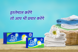


Helping an iconic regional brand ‘Raj Superwhite’ to strengthen its reach with effective brand communication
Brief & Background:
Raj industries have been into the business of detergents and fatty acids since 1956. Moving on the growth path and having established a name in the laundry soap market, the group ventured into manufacturing of synthetic detergents based cleansing products in 1987 and started Detergent Cakes in the popular and premium category.
Raj Super White a white coloured washing soap is a flagship product of the company with a commanding presence in major northern and western states of India. The great customer loyalty and growing volumes led the group to embark on a journey of going national in 2018.
We successfully took on the challenge of revamping the iconic blue packaging of Raj Super white with the sheer design strategy. Now the brief was to create suitable communication design for the new packaging of Raj Super White which will bring forth the USP of the white bar.
Deep Diving:
The first step was to understand the TG who still relies on a good washing soap for cleaner, brighter clothes, followed by learning the attributes of the product that was so popular with the existing consumers.
What made the soap score over the other popular detergents was, that it was made of natural coconut oil and it was a white soap bar, unlike the other blue bars. This unique proposition was strong enough to latch on and leverage as USP for the brand’s communication.
Approach & Solution:
For Raj Super White, consumer trust is deeply rooted in visual identification like colours & symbols in tier two towns and villages. With this learning, we took a strategic call to make a very direct speaking design and content with a focus on conveying the efficacy and attributes of the product.
Going further, roping in Heena Khan, as a brand ambassador is the most interesting initiative taken for the brand. The popularity with the masses was sure to take the Brand into most Indian homes and we leveraged it with a great story for the Ad-film. Since it was a launch, apart from the glamour and credibility that Heena khan lent to the product we categorically kept the film functional. The product attributes were converted into a core idea of “Teen Guno Se Bhara“ Raj Superwhite to make it easy for the consumers to recall. The idea was fleshed out successfully into a full-fledged campaign across other mediums including Aston Bands on various channels, Outdoor & POS.
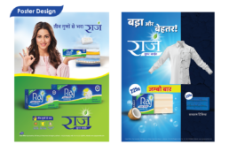
Across the mediums, we used blue & green colours for the background which is the identity for Raj Super White packaging along with the core idea ‘Teen guno se bhara’ to have a synergy across different modes of communications.
Since the TG of this category relies heavily on visual cues and we decided to leverage them in our design with the use of graphics that would show the efficacy of product clearly on both white and coloured clothes. The images of Heena Khaan with the product were used across mediums to really get all the leverage with her popularity and glamour.
For print medium, we created three easy to interpret pneumonics stating the three benefits of the white bar. Simple graphics along with short Hindi lines stating “Kam Ghisai Jyada Dhulai” showing economical benefit, “Kapade Rahe Naye Dhulaai dar Dhulaai” showing the mildness of the bar and “Hathon aur Tvacha Ka Dost” showing the benefit of having coconut oil in the bar that is soft on the user’s hands.
For TV bands we used multiple poses of Heena Khaan showing off the product to keep it dynamic. We kept the tone of communication conversational rather than statements, unlike print medium. More focus was on the product itself as it neede to grab the attention.
All the content created for various mediums for Raj Super White were made functional yet attractive and were perfect for the TG.
ClientRaj IndustriesServicesBrand ManagementYear2018