Food Packaging Design in times of FSSAI
Food packaging design today is a serious business with more and more brands offering conveniently packaged food, from Makhanas to coconut water. It can be a dream project to work on any creative, as it allows the creative freedom to express food as an emotion that can pull the consumer towards it before he realizes it. While it becomes the face of the brand, packaging has to serve a primary yet significant role when it comes to food, and that is, of giving comprehensive information about the product inside, be it ingredients, usage, consumption details which eventually aid the consumers to make the right choice.
Now, more and more bodies are regulating this information, the authenticity of it primarily is extremely active globally. FSSAI in India is the one that is currently regulating the laws for food industries, especially packaged food and beverages and is ensuring strict enforcement of the laws it has set for the same.
This, in turn, has a significant impact when it comes to packaging design, creatives need to regard it as a comprehensive piece of lawfully viable communication, to the consumers and not just an aesthetically attractive pack to lure them into an unrealistic story. Well, there is no reason to get disheartened, I see this as more of a challenge and an opportunity to talk real with the consumers, tell them stories they will believe and you are sure to have them back looking for the same pack.
It’s only a matter of understanding the simple rules set by FSSAI and using them as guidelines when designing. If not adhered to, it may lead to serious implications for the brand, like withdrawing the products back from the shelf or taking other corrective measures to ensure the compliance’s are met.
I am listing the key set of guidelines that the brands need to follow on food packaging and labels.
Name of the food including the trade name and the description should be clearly mentioned on the FOP
Ingredients to be listed as per the guidelines on BOP
Correct Nutritional information in a suggested table format
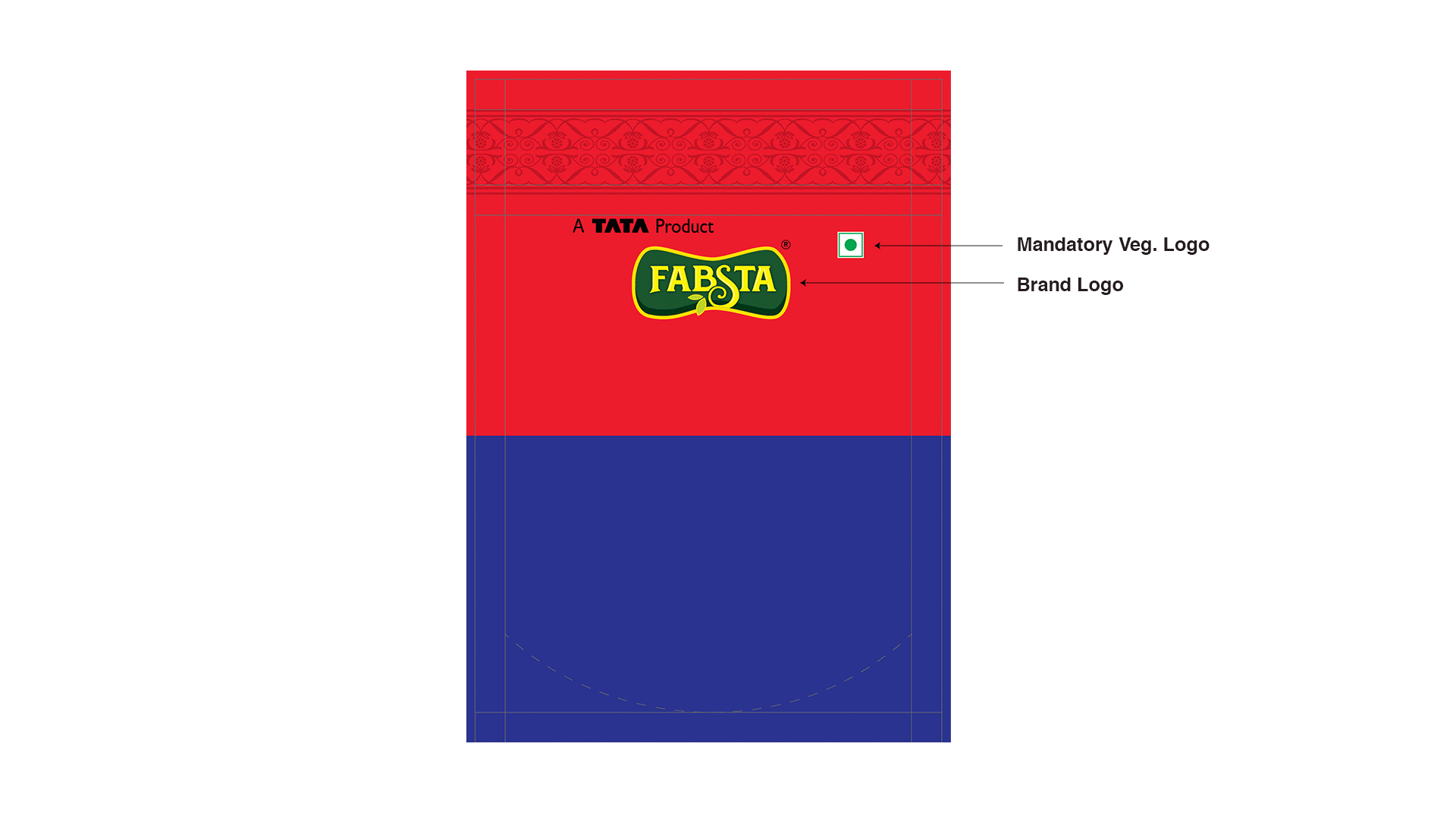
Vegetarian and Non Vegetarian food declaration to be done with the right sized Green and Red marks respectively on the FOP
Name and complete address of the manufacturer and the marketer to be communicated clearly along with Customer care details
Net Quantity in terms of Weight, Volume or Number to be declared clearly
Retail sale price and expiry date should be an easy find on the pack
FSSAI logo and license number of the Brand to be mentioned in the bold specification.
Batch identification number, the date of marketing, country of origin
The instructions for use should be clear. Visuals depictions, in this case, work better.
So the content framework for the pack, especially the BOP needs to largely follow the FSSAI guidelines but can be designed in the coherence to achieve the desired creative output.
On the Front Panel :
The key drool visual on the pack can take a flight of fantasy but with a disclaimer that the depiction is for presentation purpose only. Misleading the consumers with over-exaggerated and senseless product depictions can only harm the brand in the long run, as trust plays a key role in brand building. The product has to deliver what had been depicted and vice versa.
Avoid depicting real fruits, veggies etc on products that do not contain those ingredients in the required percentage. Especially in the beverage category, that act as a key differentiable between a Fruit Flavored Drink, to Fruit Juice. As designers, we can take up the challenge of communicating the right information in a most aesthetic way to help the consumers to choose, when at the shelf.
Avoid using misleading nomenclature for Product descriptors, for e.g natural, healthy etc. cannot be used as a claim for any of the packaged products. Instead, if the product is low sugar or healthy alternative, generic terms like good for you, inspired by nature can help achieve the desired impact.
GDA panel or a mini nutritional panel mentioning the amount of energy, total fat, total sugar and salt per serving and the percentage contribution to recommended daily allowance is must on the FOP now. It is ideal to integrate it as a part of the design during the process itself seamlessly, so it does not look like a force-fit when placed after the entire creative is done.
Just like the visibility of branding and design is a key to great packaging, visibility of all the mandatory elements on the BOP is important and hence the colour and image play on the Back panel should be tackled accordingly.

Last but not the least, don’t forget to put the keep city clean icon on the packs, I think, this message should get a significant place and visibility on the packs in order to register in the minds of the buyers. Well, FSSAI currently only asks us to put it on BOP, but brand owners and designer together can definitely rethink this aspect on the packaging as a collective responsibility towards society in general.
So when it comes to launching a new food brand or revamping the existing one to gain better shelf and consumer share, it always helps to rope in the experts in packaging design who understand the guidelines and use them wisely to achieve the brand’s marketing goal.