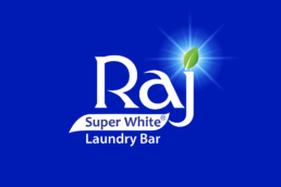
Helping an iconic regional brand ‘Raj Superwhite’ to expand its reach with an objective to challenge the national brands.
Brief & Background:
Raj industries have been into the business of detergents and fatty acids since 1956. Moving on the growth path and having established a name in the laundry soap market, the group ventured into manufacturing of synthetic detergents based cleansing products in 1987 and started Detergent Cakes in the popular and premium category.
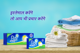
Raj Super White a white colour washing soap is a flagship product of the company with a commanding presence in major northern and western states of India. The great customer loyalty and growing volumes led the group to think about embarking on a journey of going national, one milestone at a time.
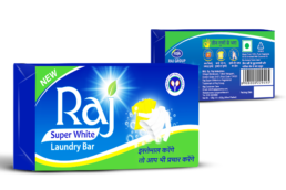
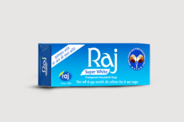
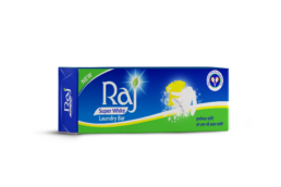
It’s always a creative challenge to propel a regional brand with a sheer design strategy. This is what excited us the most about the project. So the brief was to revamp the iconic blue packaging of Raj Super white with the 70g SKU in focus.
Deep Diving:
The first step was to understand the TG who still relies on a good washing soap for cleaner, brighter clothes, followed by learning the attributes of the product that was so popular with the existing consumers.
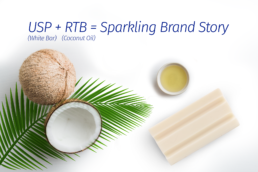
What made the soap score over the other popular detergents was, that it was made of natural coconut oil and it was a white soap bar, unlike the other blue bars. This unique proposition was strong enough to latch on and leverage as USP for the Brand Revamp.
Approach & Solution:
RSW with its basic blue packaging had a very regional touch but was a powerful visual identification for the brand. Consumer trust is deeply rooted in visual identification like colours & symbols in tier two towns and villages. With this learning, we took a strategic call to make an evolutionary change in the design with the focus on conveying the efficacy and attributes of the product.
To the existing RAJ logo, we added a little green leaf with a glow to highlight the naturalness of the product as it is a strong claim in the detergent category. We retained the blue but brought in a wave of green for naturalness and freshness. Since the TG of this category relies heavily on visual cues and we decided to leverage them in our design with the use of graphics that would show the efficacy of product clearly on both white and coloured clothes. The coconut oil feature was converted into a seal of surety.
The evolutionary design for Raj Super White Bar came to be in a refreshing packaging that helped the Raj industries step in the national detergent bar market with a fresh new avatar.