BREWING a worthy Identity & Packaging Design for a PURE GOLD CUPPA!
In just a few centuries, coffee has evolved from a wild berry to a beloved household drink many wouldn’t want to live without. With an estimated 2 billion cups brewed each day, coffee has become an extremely important part of our world today!
The coffee lovers looking for a quick caffeine boost almost always grab a cup of Instant coffee as it’s super-convenient yet super satisfying. They say, you can smell a great coffee from a distance, and a great coffee is made from great beans.
With its inherent expertise in coffee making, a fine coffee offering under the own brand FABSTA was a great move.
The product on offering was an instant, 100% Pure, Gold standard coffee to give you 100% pure coffee experience in every sip. The finest blend of aromatic Robusta and Arabica coffee beans, its finesse and quality par excellence had to be translated effectively on the packaging.
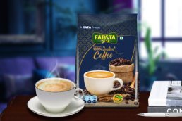
We decoded how our product matched the love and addiction of coffee lovers and arrived at a parallel code of it being the ‘Blue Label’ of coffee. A Deep Royal Blue with matte Gold thus followed the code of Blue Label for packaging, both the colours denoting elegance and magnanimity. A pattern of gold ‘Fleur-de-lis’ on royal blue colour in the simple graphic form was created for the background. From antiquity, Fleur-de-lis has been the symbol of purity and royalty.
The product name was treated in elegant and flowy typography to add a touch of individuality as, coffee, however premium has to have a touch of warmth to it.
A tempting image of steaming cup of ready to drink coffee sat among the dark coffee beans with the warm lighting emphasizes on the rich flavour and aroma of the coffee brew. All the drama visualised for the packaging graphics was brought alive through carefully reproducing the artworks with the right amount of gold, gradient effects, colour correction and a couple of prototypes.
The result was a very premium and intense packaging design, totally worthy of the product itself!