
Creating wholesome packaging design for ayurvedic health juices – Zandu
Zandu is a major part of the Emami empire. Zandu’s greatest strengths have been the research, study and innovation based breakthroughs in contemporary sciences and healing.
Herbal health juices like Amla, Aloe vera, etc. are fast turning into an in-demand category in the juice market as Indian consumers seek healthier alternatives to packaged fruit juices that often contain additional sugar and sweeteners. In addition to same, change in lifestyle, health conscious attitude has made a consumer shift from fruit-based drinks to fruit juices as they consider the latter a healthier breakfast/snack option. As well as the pandemic situation has sparked a ‘healthy and immunity boosting’ food movement in the market worldwide.
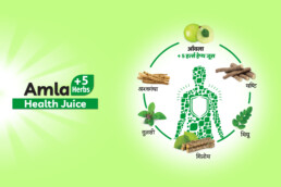
Considering the high need opportunity potential, Zandu Ayurveda decided to venture into this category with three herbal health juices: Amla Juice, Aloevera Juice, & Karela Jamun Juice.
As soon as we received the brief we started with the research in juices category market, especially health juices category. We focused on understanding the consumer perspective as to define this product as a effective ayurvedic health supplement with authentic ingredients and ‘not just another juice’.
We concluded that the design should reflect the key category cues, codes & drivers, like the ingredients and health benefits of the product that associates with consumers. We also had to keep in mind that packaging should bring out the design harmony with master brand architecture with clear propositions.
As our primary TG is the one who is seeking a natural & safe herbal juice with magnitude of health benefits. Who faces various health issues due to unhealthy lifestyle, as well as the one who has the desire to keep themselves healthy & fit in the long run. Hence, we deducted that the main focus on the packaging should be the health benefits of the product.
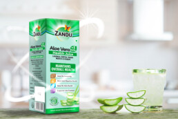
With a bit different structure from herbs and medicines to establish the new juices category, we followed the ‘Zandu Product Architecture’ with green top patch, to continue the synergy. The ‘main ingredients of the juice’ was kept as the main visual for the design; as familiar authentic ingredients in herbal/ayurvedic products prominently drive the trust factor for consumers. The ingredients imagery was placed near bottom with much importance but still not overpowering the pack as it is indeed a health juice and not a fruit juice category.
We clearly distinguished the each product from each other with ingredients inspired different background colour for each pack, e.g. Purple for Karela Jamun.
The major ingredients of the juice were listed right below the name of the juice, which was placed in the form of a green unit along with leaf shape to emphasize again on the natural source.
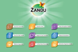
The primry benefit/function of the product e.g. Immunity Booster, was placed in the middle with utmost importance as we observed through our research, the unique health benefit is the driving factor for the health food category. The secondary health benefits/ product attributes we listed below with easy to understand mnemonics to help consumer make a well informed choice.
A unique seal was created to highlight an important product attribute – “Free from synthetic colours & flavours”, as it contributes to the consumer trust who are looking for natural and authentic health food products.
With people becoming more and more focused on health and immunity amidst pandemic problems & challenging lifestyles, looking for healthy alternatives; this product was a needed answer. We are very proud we were successful to procure the desired results for packaging of these health juices and make them a hot pick on the shelf.
ClientZanduServicesPackaging DesignYear2020
Share