
Creating packaging design for Zandu Hand Sanitizer, a top ayurvedic brand in India.
Zandu is one of the flagship brand of the Emami empire. With glorious past and authentic Ayurvedic products that made life better for consumers year after year, Zandu has become a trustworthy name among Indian consumers when it comes to Ayurveda.
While Zandu brings products primarily based on Authentic Ayurveda, its greatest strengths have been the research, study and innovation based breakthroughs in contemporary sciences and healing based on Ayurveda. So, when a pandemic like COVID-19 hit the nation, along with the range of immunity boosting products that were most useful .The hand sanitizer is one such product that has became the need of the hour for every household due to the pandemic. The Zandu team understood this market need. Though numerous hand sanitizers were available in the market, theywere mostly chemical based or lacked natural ingredients, which along with disinfection could also give gentle protection. With the Ayurveda background, Zandu team developed a sanitizer that combined the natural benefits with the sanitization amd planned to launch a Ayurvedic Hand Sanitizer.
The first step was to understand the TG who believes in nature’s goodness; followed by learning the attributes of the product that made it stand apart from the regular hand sanitizers.
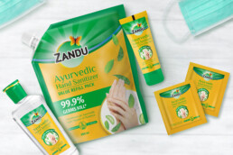
Zandu Ayurvedic Hand Sanitizer is an effective sanitizer gel with natural active ingredients like Neem, Tulsi and Aloevera. What made it score over the other sanitizers was, that it was 100% Ayurveda based sanitizer and it had added goodness of the ingredients known to soothe the skin along with sanitization. This unique proposition was strong enough to latch on and leverage as ‘USP’ for the packaging design.
The sudden clutter in the category made us take an overtly visual route and we decided to leverage the ingredient and its goodness in our design with the use of graphics that would cue the naturalness in a very direct manner to the consumer.
An earthy shade of mustard yellow was chosen for the background to cue in the Ayurveda aspect of the product. The use of serif font for the product name further accentuated the Ayurveda origin.
A very prominent circular graphic unit was designed showing the hands encircled with active ingredients i.e. Neem, Tulsi & Aloevera; to highlight the natural ingredients story along with usage.
The graphic unit was coupled with “99.9% Germs Kill” band to bring forth the claim and the efficacy of the product clearly. ‘100 Years of Ayurveda’ seal further brought the credibility and trustworthiness to the product.
The whole structure followed the ‘Zandu Brand Architecture’ with green top patch, to continue the synergy across products. Yet, the design was successful in conveying the prominent ‘Natural Ingredients and Ayurveda Origin’ story.
The real challenge indeed was to pull this all up amid the country wide lock-down. But, with the understanding partnership with Zandu, the packaging design for its hand sanitizer was delivered on time and turned out to be a success.
ClientZanduServicesPackaging DesignYear2020
Share