Fruit drink is one of the most popular beverage categories in the world. They are loved by young and adults alike for their sweeter taste and fruity flavours. The popularity of fruit drinks is growing among young consumers as on the go thirst quenchers. Mothers prefer fruit drinks over buying soft drinks for their kids.
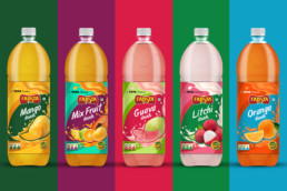
Catering to the increasing market for the fruit drinks, Fabsta launched a range of fruit drinks with 5 variants – Orange, Mango, Litchi, Guava and Mixed Fruit. The category already has many popular players, hence the challenge was to make the fruit drink bottles leap out to the consumers of the shelf.
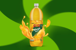
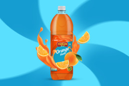
We understood that fruit Drinks are more about the choice of flavours and rich taste! The sweetness and pinkness of guava, the tanginess and freshness of orange and so on…These natural fruit qualities were the inspiration for our design concept and we decided to bring out the ‘Oh So Luscious’ appeal to the range. we chose ‘bright and pop’ palette of colours varying according to the juice flavours for the bottle labels with the idea of balancing the natural fruity colours to create the desired contrast on the shelf.
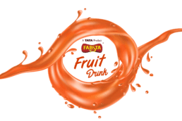
A concentric abstract pattern was created emerging from the fabsta leaf structure and was wrapped around the entire label to give an effect of juice pouring in. A tempting splash of the drink was depicted oozing with the fruits in their full glory.
The USP of our product was the ample fruit content and we wanted to communicate that up front to the consumers who choose the best. The colour schemes also made it easy for consumers to choose their favourite flavours.The typography of the product name was also kept flowy and fun maintaining the liveness of the whole package.
A very fruity and poppy range of packaging design of the Fruit Drinks came alive for its millennial audience, that expects the best of the flavours from the house of TATA.