Brand Visual architecture and Packaging Design Revamp for Attitude a flagship brand by Amway.
Attitude is a premium personal care brand from the stable of Amway with a range of products in Skin & Color Portfolio. The USP of the brand is its well researched formulations based on herbal recipes, specially designed Indian Skin Care. However the brand did not want to be reflected as a traditional herbal brand standing against other competitive herbal brands . The current brand visual architecture lacked in communicating the Brands unique proposition and evoke the desired premium appeal and the value it offered at a premium price. The target audience that the brand intended to talk to ranges from women aged 25 to 35 and the spirit of youthfulness is what had to reflect in the revamped visual architecture.
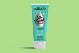
We started with understanding associations the TG build with the brand name attitude and hence the expectations from the brand. The dipstick research gave us a few but significant take away s. The brand even if based on Herbal should connote Modern Herbal, one that the young Target group can associate with more like a BFF in skincare for the TG. The Brand should not only look modern but Sassy enough to be instagrammable with a high flaunt value. Ingredient driven good ness should come across evidently as a solid reason to believe and buy. With these and more cue our brainstorming sessions were fruitful and we came up with a cool name for the first range of Nourishing creams that were to be launched. We called it INSTA NOURISH insta standing for both instantly nourishing and as abbreviation for Instagram
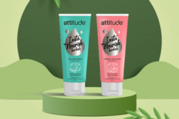
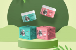
Next was to give the brand a visual architecture that would be seamless yet fluid to flow on the diverse range of the products from suncare to brightness creams to lotions.
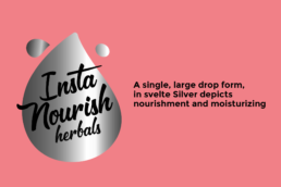
We decided to highlight the key benefit of the particular product range in the form of a bold key visual and that became the design language for the brand. A single, large drop form, in svelte Silver depicts moisturizing and nourishment and is the visual highlight of the nourishing range along with modern illustrations of the key ingredients to fortify the benefit claim. This design was a win win the the focus groups that were conducted with the TG across 3 cities Mumbai, Delhi & Calcutta and the young TG could relate to the revamped Attitude in terms of its visual language. The fresh, youthful color pallate was a important driver in the brand refresh to bring about the desired youthfulness. Conceptually the brand has been thought through for all its future product lines in terms of the look and feel and a seamless design style and thats the beauty of strategic approach, we bring to any branding exercise.