Brand Styling & Packaging Design for a Startup brand launching a premium personal care range – TRU NATURELLE
Truveda – a company that traces its origin to a legacy of Ayurveda spanning three generations. With its strong foothold in Ayurveda or ‘The Science of Life’, a part of the 5000-year-old Vedic heritage of India, wanted to enter into personal care space that embodies Ayurveda in a modern avatar.
Today as people are conscious about their lifestyle, there is a slow shift, back to imbibing the good old, proven ways of living. However, the authentic, natural living practices, especially personal care contradicts with the current fast paced lifestyle and is inconvenient in practice. Thus Ayurveda based personal care category is evolving slowly as Indian and international consumers seek natural and safer alternatives for personal care. Truveda was entering into an already evolving category but with a strikingly unique offering and they partnered with us to bring those to the life.
Tru Naturelle by Truveda is a brand offering range of World-class Skin & Hair Care products, Specially Made for Moms with priceless Natural Ingredients and Certified by the strictest International Standards of Safety. The brand has to be pegged as premium, modern Ayurveda brand, distinct from the clutter.
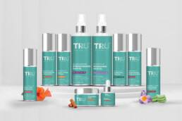
Our primary TG is a mother who amidst her multitasking seldom finds time for skin/ hair care and beauty rituals. The approach, therefore, was to keep the design language clutter free and minimal, that would give a sense of space and calm to the TG. The naturalness was reflected in the TRU logo with the use of vector natural elements in a rather contemporary style. A distinct and premium color palette had to be followed for the entire range that would bring out the brand promise of naturalness in a subtle manner. Silver with a Ocean green color formed the core element of the Brand Style complemented by pearl white.
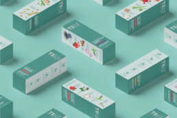
Every product from TruNaturelle stable is manufactured using the premium, highest quality, proven natural ingredients and using best-in-class processes because Moms deserve the Best. While the face of the brand was kept bare minimal with a clean typography, we had to convey the story of the exclusive blend of ingredients and a different one for each product. On one hand was this story and the other hand, a set of brand virtues that would enable TRU to stand out from the competition. Made for Moms: Products specially developed to address Skin & Hair care problems of Moms.
Best of Nature: Pure, precious, potent Natural ingredients inspired by Ayurveda. Dermatological Tested: Allergy Certified® & Suitable for all skin types Safe Cosmetics Australia Certified: Made Safe® & No Toxic Ingredients. Ethical & Cruelty-free: No Animal Testing, Responsibly Sourced. We decided to use two side panels to elaborately talk to our consumers about what mattered when making the choices. The ingredients were shown in full glory, labelled so as to make it easy for the mom to understand what is going inside. A set of icons were developed to depict the brand virtues in the most affirmative and easy manner. A matt finish to the label with a spark of silver brought the balance of the natural and effective in the finished look. Then there were multiple formats of the products, short and tall, tubes and jar and the brand style was seamlessly carried with all its virtues to the entire range of products. What came out was an elegant, appealing new brand that stood out distinctly with its unique brand promise reflecting clearly through its Design Style on the eCommerce shelf.
ClientTru NaturelleServicesPackaging DesignYear2020


