FIVE Neon coloured packaging we loved, to beat the monsoon blues.
When gloomy Mumbai Monsoon makes you go dull, turn to colours to feel fresh and lively! At least that is what we believe at TCT.
Let’s talk about neon colours in particular. They make you feel young and bold instantly. They grab your attention in a snap and play games with your brain till you are filled with that colour mood. These intense hues hint at our tech-crazy society and love of all things energetic.
First came millennial pink, then there was Gen-Z yellow and melodramatic purple, and now there’s neon green. Pastel and muted tones take the back seat this year as neon palettes own the colour spotlight.
To help you beat the boring monsoon blues, we are sharing few crisp and lively packaging designs in neon colours that we thought were interesting. Also, we are featuring our own design range we developed for Fabsta Khari.
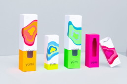
- Yümi is a unisex cosmetic brand. Yümi sells body lotions, shower gels, perfumes, etc. for both women and men. The packaging reflects the need to break the traditional codes of the market by using off-the-wall humour. It is designed by Natacha Algani.
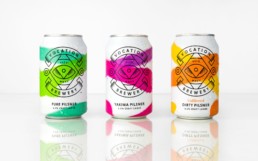
- Robot Food have designed the identity and packaging for West Yorkshire based brewery Vocation‘s inaugural range of Pilsners. With neon sprays on clean white cans, the visual language and mood created by Robot Food is quite atypical for Vocation and craft beer packaging in general.
- ‘Eat & Go’ is a ready meal for students. Designed by Frutodashiki, Russia; packaging is a plastic tube which is constructed as bellows and could be easily folded down decreasing the length of the tube (like bending section of a drinking straw). With this packaging, one can eat the sandwich without getting their hands dirty. Empty packaging when fully folded is very small and easily fits into a pocket. Plastic cap lets you securely close your unfinished meal and eat or in case of soup drink it later.
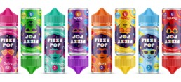
- Another crazy packaging is of liquids for electronic evaporators from Omega Liquids Company. The creators have gone crazy, gathering the line of rather unusual flavour combinations in one range. Therefore, it evokes very bright emotions, fresh and even crazy. There is a strong association with the ’80s in the USA. A typical feature of the then fashionistas was the afro hairstyle, which became the main symbol on the label. This project designed by Aleksei Pashnin goes for both subtle and strong design cues.
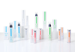
- WIN is a highly minimal brand, and the ultra-pure package’s language reduces its essence into the purest, simplest abstract form: the blurred vertical line, that symbolizes the gesture of the finger applying cream on the skin, is the only ornament on the packaging. This makes the collection stand out on the shelves: a big amount of white isolates it from the other products and the vertical neon colours direct the eye. Dynamic typography reinforces the product-to-consumer winning discourse about the power of pure things.
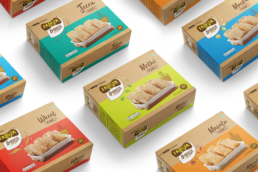
- Fabsta is a brand from Tata in FMCG Food sector. Its branding is developed by us from the root. When we were given the task of making the everyday chai-time snack look interesting and more (to simply put – not boring) fun, we went all guns blazing with the eye-catching neon colour palette. On a brown colour background (which is a signature style for whole Fabsta Bakery range cueing in artisanal baking style) we incorporated bright and lively neon coloured bands with a different colour for each variant. The result was super fun on the packaging and a super hit on the shelf.
We hope you feel as bright as these fun packaging designs. Have a ‘colourful’ Monsoon!