Defining the Brand Personality and the Brand Communication for the ‘Quik’est growing e-grocer in town.
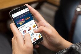
Nobody today shops exclusively through a single medium. Consumers of all generations buy online, in-store and on marketplaces, from legacy retailers and independent brands alike.When it comes to grocery, omnichannel is the way to go, given the expanding middle class with better web access, and paucity of time. So for Star Bazaar, one of India’s leading hypermarket chain with a strong consumer base, having a presence online, was a need of the hour and thus StarQuik was born, as an online arm of Star Bazaar.
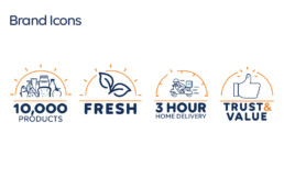
StarQuik introduced a grocery shopping practice that is so easy and enjoyable by bringing 10,000 plus products including the freshest fruits and vegetables home delivered at the doorstep within 3 hours, backed by Tata, ensuring trust and value for the consumer.
Given the nature of the business, online grocers are in a different league from other e-retailers. Our task was to bring a shift in consumers minds to enable them to switch to online as a channel of choice to buy grocery and daily essentials. Then further establish StarQuik as a preferred part of the grocery buying consideration set by building sufficient reasons. It was thus essential to building a layered experience so that the customer interaction with the brand is enriching even if were as mundane as buying grocery.
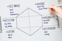
With the logo already in place, we started with defining the Personality Traits for Brand Starquik as that would prove to be the guiding light for all the future communication.
Going further we contrived the ‘Tone and Voice of Communication’ that resonates with our brand personality Traits, being – Approachable, Optimistic, Crisp & Clear, Consistent and Friendly.
For the Brands Core Colour Palette, we selected 4 strong colours: Dark blue for the expertise, Light Blue for the ease, Orange for freshness and White for trust and quality.
We developed a distinct Visual Identity System, using imagery and illustrations and an ownable typeface. ‘Volte Rounded’ gives StarQuik a friendly, warm and real voice. The tone of the graphics and Illustrations across all the media were kept contemporary, simple and thought-provoking.
For the Brands Core Colour Palette, we selected 4 strong colours: Dark blue for the expertise, Light Blue for the ease, Orange for freshness and White for trust and quality.
StarQuik is all about the ‘ease’ of getting the choice of grocery products and getting the freshest fruits and vegetables delivered at the doorstep within 3 hours.
We summed it up in the brands’ core thought ‘Aasaan Grocery’. It became the leading thought that enabled to generate campaign ideas for Brand communication. Across all media, we created imagery that reflects the brands’ core thought of Aasaan Grocery in a dynamic & imaginative manner and reflected the Brands promise of freshness and great quality.
Finally, we prepared StarQuik Blueprint, a brand guideline and implementation control manual in the form of a navigable PDF format.
Taking StarQuik ahead with the imagining and designing a complete identity system and making it a brand with a multi-dimensional look and a strong presence was a quest we loved to conquer.
ClientStarquikServicesBranding, Brand Communication, Social Media MarketingYear2018
Share