Goodness of Natural Green Tea’s translated to a delightful Packaging for FABSTA!
Brief & BackGround:
Green tea, native to China and India, has been consumed for centuries but has only recently gained popularity globally for its health benefits.
Out of the total Tea consumption in the world, green tea is only about 20 per cent. Thought a lot of people are now switching to green tea as their choice of beverage due to growing health awareness. Catering to the increasing market for the green tea, Fabsta launched a range of green tea with 3 variants to begin with – Natural, Honey & Lemon and Mint, Lemon & Ginger.
Deep Diving:
Green tea is made from unoxidized leaves and is one of the less processed types of tea, making it a premium product. Its mildness allows it to blend with a variety of flavours and flavouring ingredients making it more desirable. We had to bring out the goodness of the natural tea along with the ingredients and to convince the consumers why this is a better choice of Green Tea Brand.
Approach & Solution:
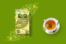
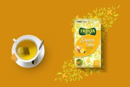
Green tea is a lighter brew compared to the normal tea and its consumer a discerning one, who has an understanding of the subtlety of flavours. So for the container boxes, we chose a light pastel palette of colours varying according to the tea flavours. The idea was to bring the essence of the naturally blended fine quality tea leaves along with other ingredients. Though commonly used, we saw a distinctiveness in the form and shapes of the ingredients, especially when placed against the bunch of tea leaves. That lead us to the drawing board where indigenous illustrated patterns were created out of a tabletop composition of the leaves scattered with the ingredients, each unique to the blend. Using the subtle colour palette, the pattern was then wrapped around the entire carton to give an effect of hand wrapped, exclusive box.
We defined the Fabstas’ trademark leaf structure at the centre of the front of the pack, with the product name in the flowy and light typography maintaining the lightness of the whole package. The naturalness of the blend was further emphasised with the use of fresh and appealing images of the ingredients, placed daintily within the leaf so that they stand out and emphasize a bit more on the flavour of the green tea.
A very classy and discerning range of packaging design of the green tea came alive for its equally definitive audience, that expects only the best from the house of TATA.